How Many Countries Fit In Africa? Visualizing The Continent’s True Size
Africa is vast.
So vast that its full scale can be hard to grasp by looking at most world maps.
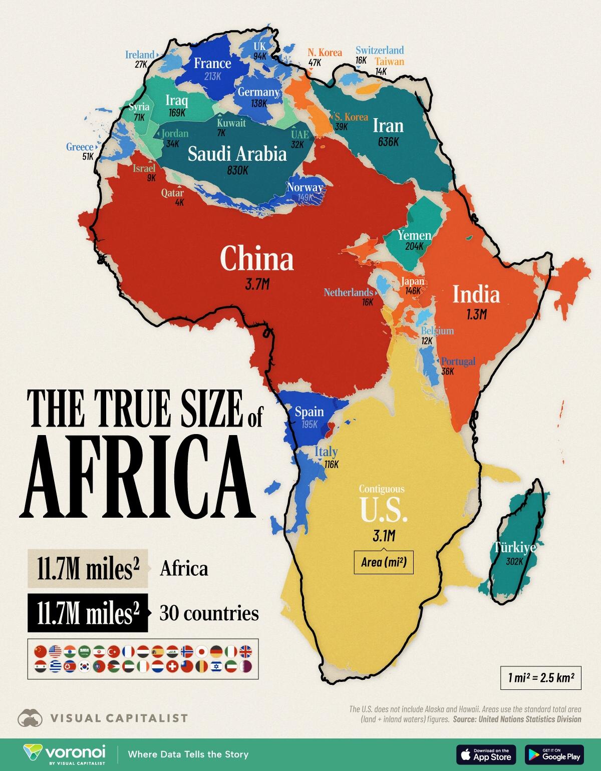
The graphic below, via Visual Capitalist’s Pallavi Rao, solves this by combining individual countries inside the continent’s area, showing that Africa’s landmass is on par with the (contiguous) U.S., China, India, and much of Western Europe combined.
Data for this visualization comes from UN Statistics Division and total area (land + inland waters) was used for this comparison.
Africa’s Area in Raw Numbers
At 11.7 million mi² (30.4 million km²), Africa is the world’s second-largest continent after Asia.
Put another way, it easily contains the contiguous U.S. (3.1M mi² / 8.1M km²) and China (3.7M mi² / 9.6M km² ) with room to spare.
Country/Region
Total Area (mi²)
Readable Label
Total Area (km²)
Readable Label
🇺🇸 Contiguous U.S.
3,119,885
3.1M miles²
8,080,464
8.1M km²
🇨🇳 China
3,705,407
3.7M miles²
9,596,961
9.6M km²
🇮🇳 India
1,269,219
1.3M miles²
3,287,263
3.3M km²
🇸🇦 Saudi Arabia
830,000
830K miles²
2,149,690
2.1M km²
🇮🇷 Iran
636,372
636K miles²
1,648,195
1.6M km²
🇹🇷 Turkey
302,455
302K miles²
783,356
783K km²
🇫🇷 France
213,011
213K miles²
551,695
552K km²
🇾🇪 Yemen
203,850
204K miles²
527,968
528K km²
🇪🇸 Spain
195,364
195K miles²
505,990
506K km²
🇮🇶 Iraq
169,235
169K miles²
438,317
438K km²
🇳🇴 Norway
148,729
149K miles²
385,207
385K km²
🇯🇵 Japan
145,937
146K miles²
377,975
378K km²
🇩🇪 Germany
137,988
138K miles²
357,386
357K km²
🇮🇹 Italy
116,348
116K miles²
301,340
301K km²
🇬🇧 UK
93,628
94K miles²
242,495
242K km²
🇸🇾 Syria
71,498
71K miles²
185,180
185K km²
🇬🇷 Greece
50,949
51K miles²
131,957
132K km²
🇰🇵 North Korea
46,541
47K miles²
120,540
121K km²
🇰🇷 South Korea
38,750
39K miles²
100,363
100K km²
🇵🇹 Portugal
35,603
36K miles²
92,212
92K km²
🇯🇴 Jordan
34,495
34K miles²
89,342
89K km²
🇦🇪 UAE
32,278
32K miles²
83,600
84K km²
🇮🇪 Ireland
27,133
27K miles²
70,273
70K km²
🇳🇱 Netherlands
16,164
16K miles²
41,865
42K km²
🇨🇭 Switzerland
15,942
16K miles²
41,290
41K km²
🇹🇼 Taiwan
13,976
14K miles²
36,197
36K km²
🇧🇪 Belgium
11,849
12K miles²
30,689
31K km²
🇮🇱 Israel
8,522
9K miles²
22072
22K km²
🇰🇼 Kuwait
6,880
7K miles²
17818
18K km²
🇶🇦 Qatar
4,473
4K miles²
11586
12K km²
🌐 30 Countries
11,702,481
11.7M miles²
30309286
30.3M km²
🌍 Africa
11,730,000
11.7M miles²
30370000
30.4M km²
Add India’s 1.3M mi² (3.3M km²) and we’re still not close to filling the continent’s footprint.
In fact, it takes a total of 30 countries together—shown in the graphic above —to equal Africa’s total area, underscoring how massive the continent is in absolute terms.
Of course, country selection can change these numbers. If prioritizing Central and South American countries instead (like Mexico and Argentina,) the comparison could reduce to 18 entities.
Including Alaska and Hawaii would increase America’s footprint by 700,000 mi² (1.8M km²).
Why Your Wall Map Gets Africa Wrong
Many of us grew up looking at wall maps that use the Mercator projection.
This 16th-century design keeps straight lines for navigation but dramatically enlarges regions near the poles and compresses those near the equator.
Africa, which straddles the equator, is one of the biggest victims of this distortion.
That discrepancy fuels common misconceptions about just how expansive Africa really is.
African Union Calls For Equal Projections Map
The African Union has asked international organizations to stop using the Mercator projection.
They say this size misrepresentation undermines the perceived global influence and importance of Africa and perpetuates stereotypes.
For example, the frequent use of the Mercator map in educational settings and media can lead many to unconsciously imagine Europe and North America as disproportionately significant.
Meanwhile Africa appears less substantial and “marginal.”
The map above also drives home another point. When discussing global development, trade, or climate impacts, treating Africa as a single bloc overlooks the continent’s enormous spatial and cultural complexity.
If you enjoyed today’s post, check out Germany’s Economy Compared to 22 European Countries on Voronoi, the new app from Visual Capitalist.
Tyler Durden
Mon, 10/13/2025 – 05:45

