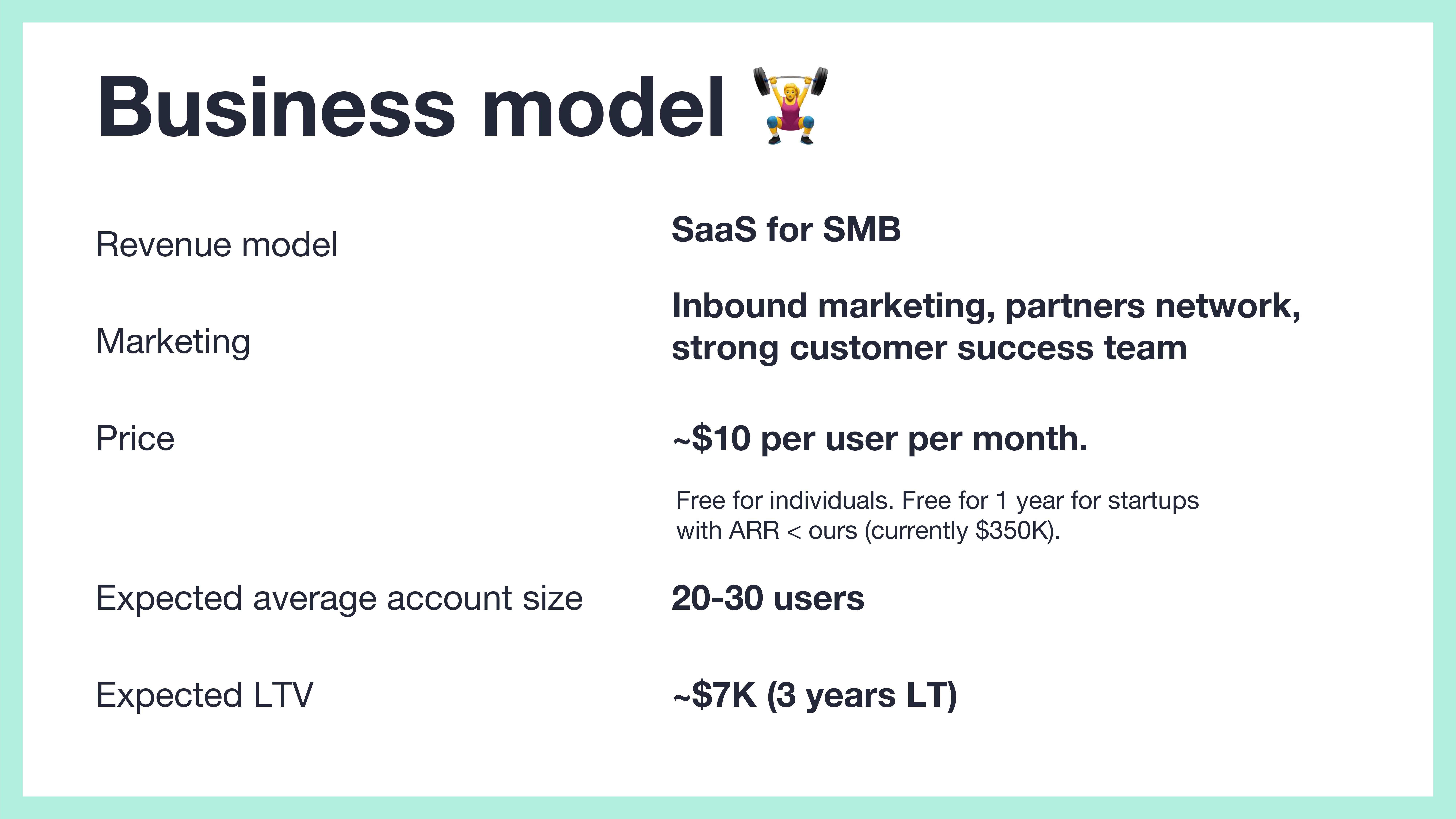
I love a good, clear business model, and Fibery’s is a pretty decent example here; it shows the high-level pricing model (multiaccount SaaS), the target market, and how it is pricing itself. It shows an expected LTV that’s pretty conservative (the $7,000 LTV using these numbers assumes an average account size of 20 or so).
Inbound marketing and customer success are both great when the customers are coming to you, and “partners network” is a little fuzzy. But it’s missing the customer acquisition cost. I’ll say a bit more about this below when I talk about things that could be improved but overall it’s a solid slide.
Metrics!
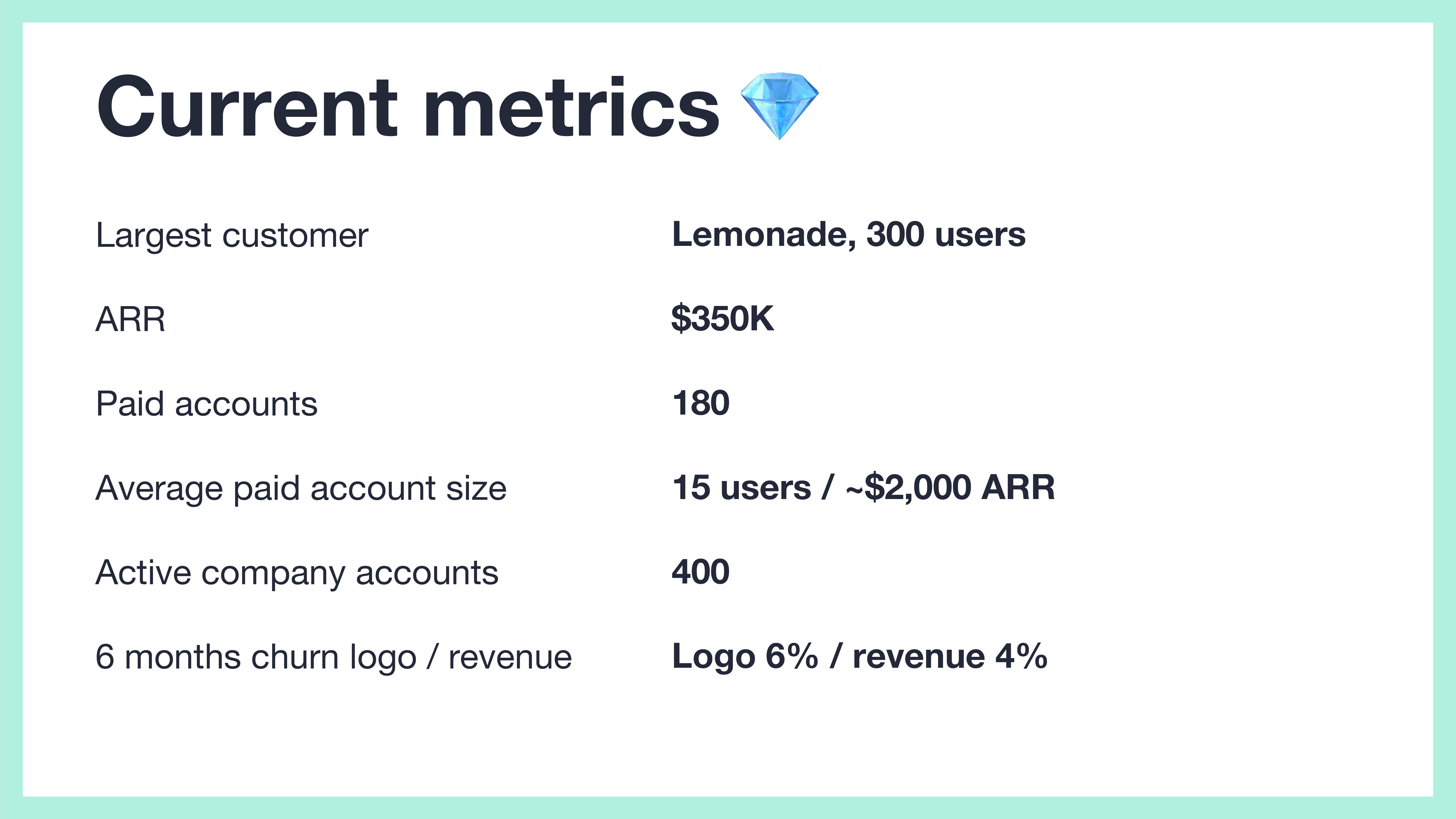
[Slide 12] Show me that traction. Image Credits: Fibery
A good traction slide forgives all sins, and this is a great snapshot of where the business is right now. The fact that the logo churn (i.e., churn of number of customers) is higher than the revenue churn indicates that the company is able to retain its higher-value customers. That’s good. The rest of the stats look good, too, for a company at this stage. Clear, simple, concise.
Still, I wish Fibery had shown some of these metrics as graphs. Having $350,000 annual recurring revenue is impressive, but if it had been stagnant for the past six months, that’d ring some warning bells. Investors don’t invest in snapshots, but in trends, so you may as well show them.
The other quirk is that the numbers are inconsistent. On slide 11, it says that the expected average account size is 20-30, but on this snapshot slide, it shows that Fibery currently has 15 paid users per account. Not saying anything about how it expects to grow that number makes me suspicious.
Bonus win: Great ask slide
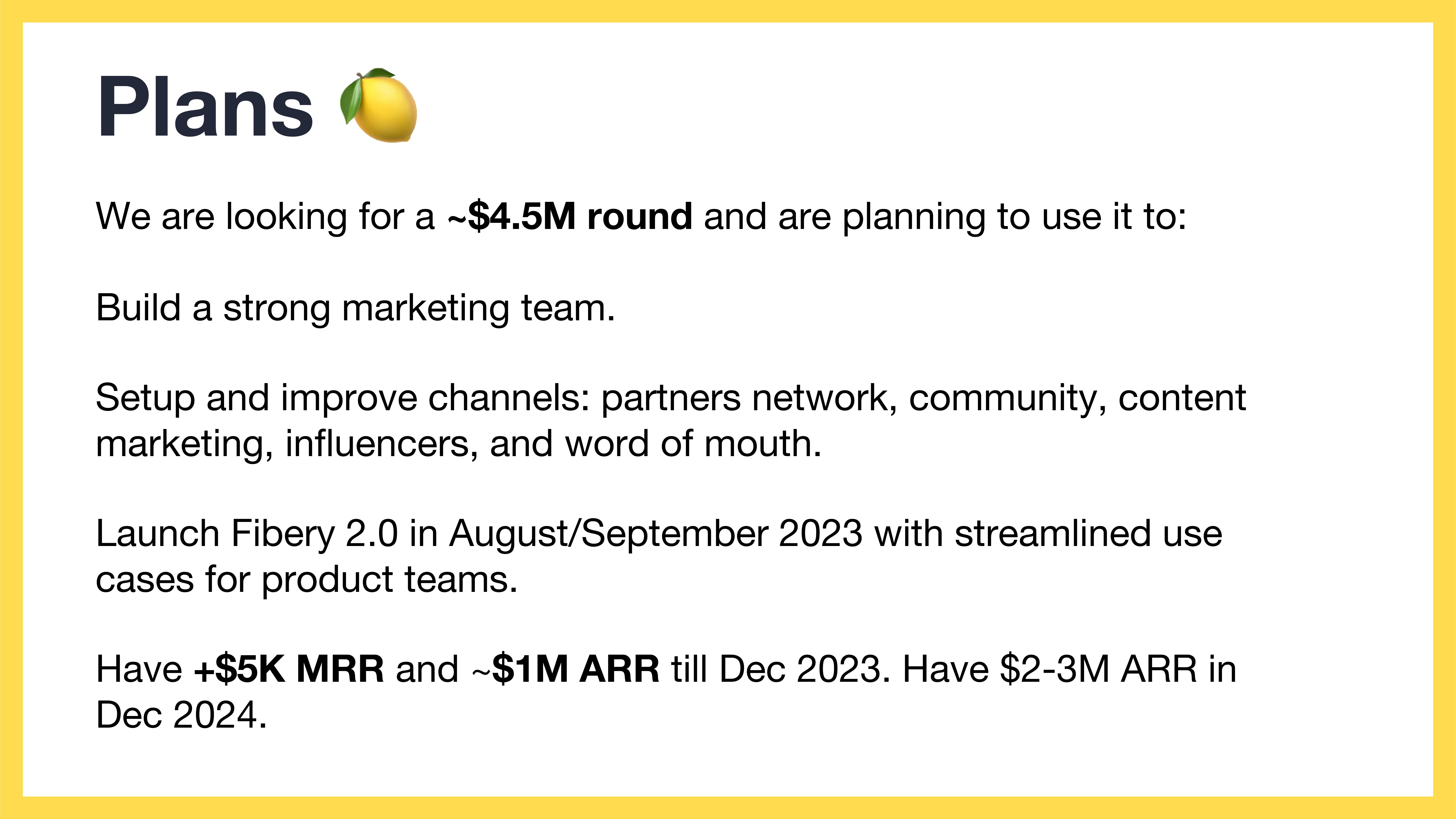
[Slide 15] Yessssss. Image Credits: Fibery
The slide is labeled “plans,” but this is what I usually refer to as the “ask” slide.